
BRANDING | PACKAGING DESIGN
Featforskin
Promotes a fluid and non-conforming definition of beauty, the objective is to make an appealing inclusive skincare brand to break the beauty rules for young millennials.
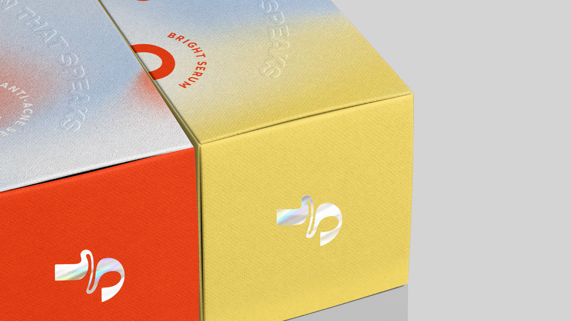
We applied the “fluid” concept to the logo and key visuals. Use a blast of bold gradient color to show the brand’s
quirkiness and the freedom to choose the right combination of skincare for your skin.


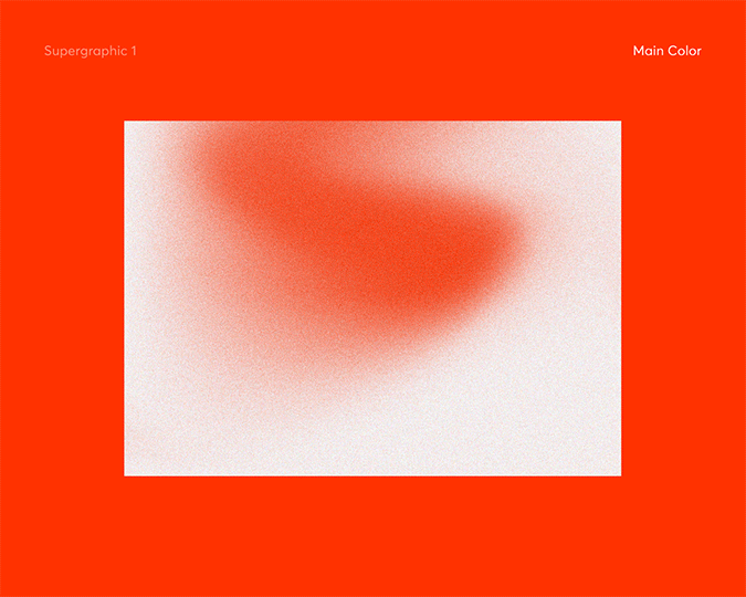
We create 4 gender-fluid-inspired supergraphics with grain texture symbolizes our pores. This pattern can be placed both in vertical & horizontal direction.
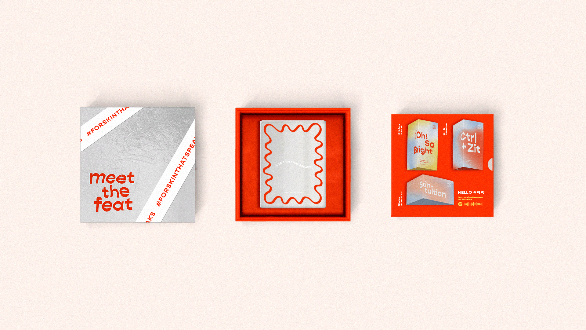
Also there are skincare related icons can be used as decoration in any media to showcase the quirkiness of Featforskin, available in 2 color combinations.


Art Director
Gissella
Printing
GL*TCH
Graphic Designer
Vania Leonyta Marsim
ClientsFeatforskin