IDENTITY & PACKAGING
Hyang Pâtisserie
A small business that sells various homemade pastries such as chocolate brownies, tiramisu, mooncake, and customized korean cake.
The word “hyang” is taken from Javanese, tends to be associated with sacred Gods and luminous personal form portrayed like the sun in a dream, as we hope Hyang Pâtisserie will give a taste that feels like heaven.

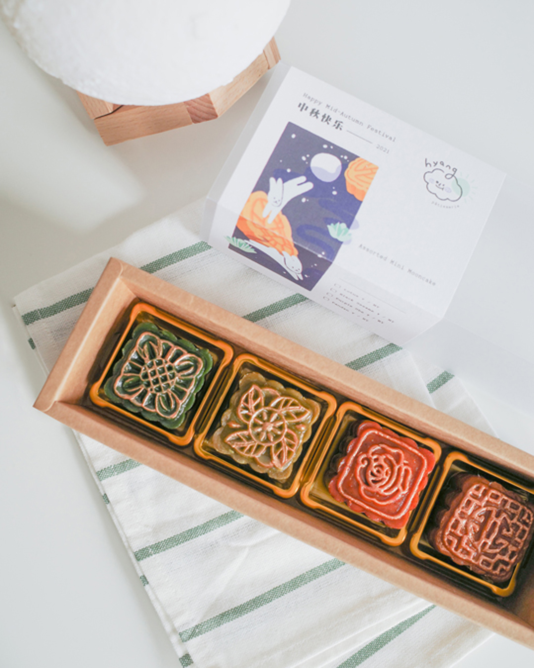
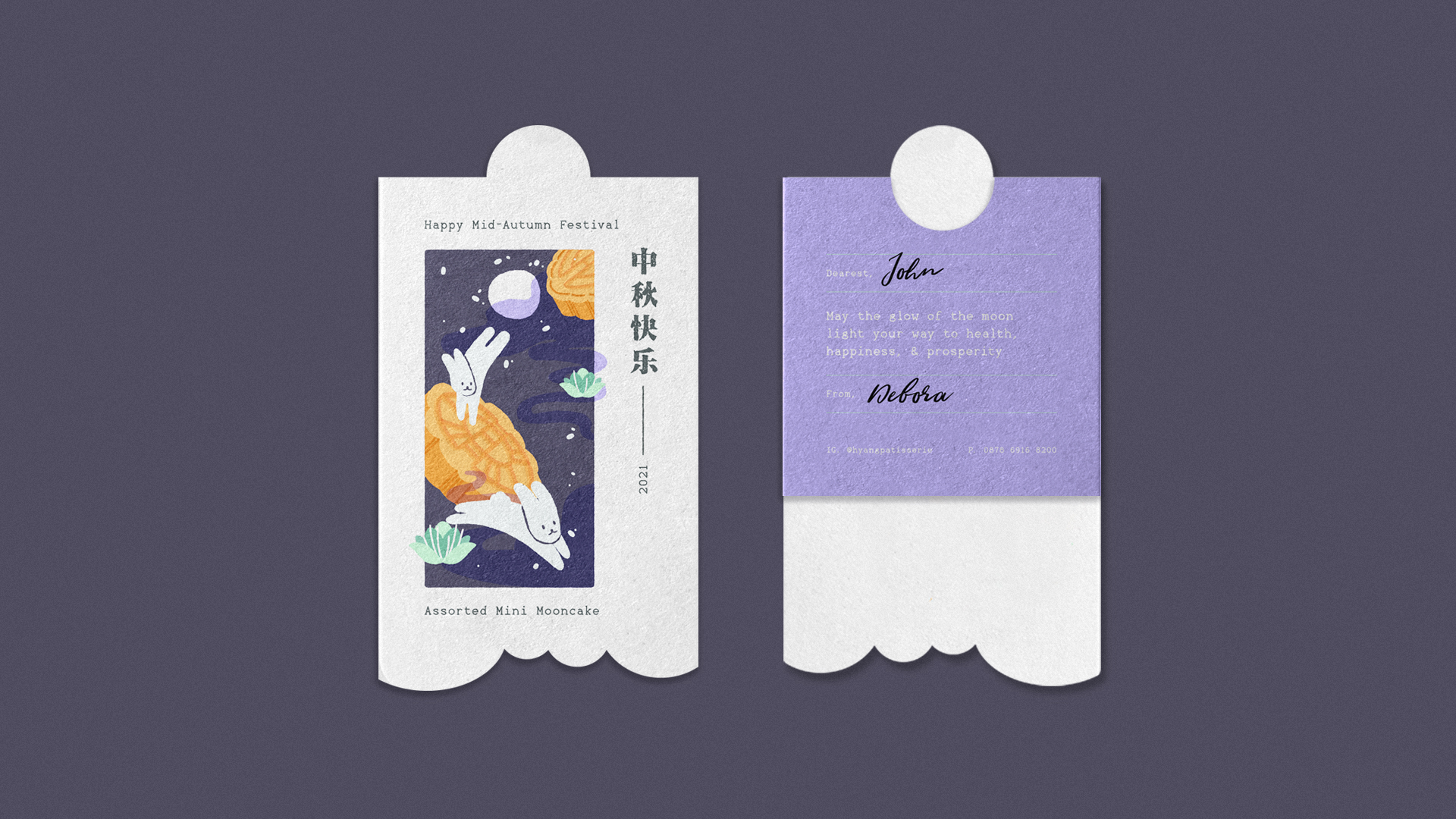
Launching on the same month with mooncake festival, Hyang Pâtisserie decided to launch their first product, an assorted mini mooncake. We created an illustration of leaping hares, as a symbol of rebirth and immortality that is commonly taken to represent the moon on the packaging.


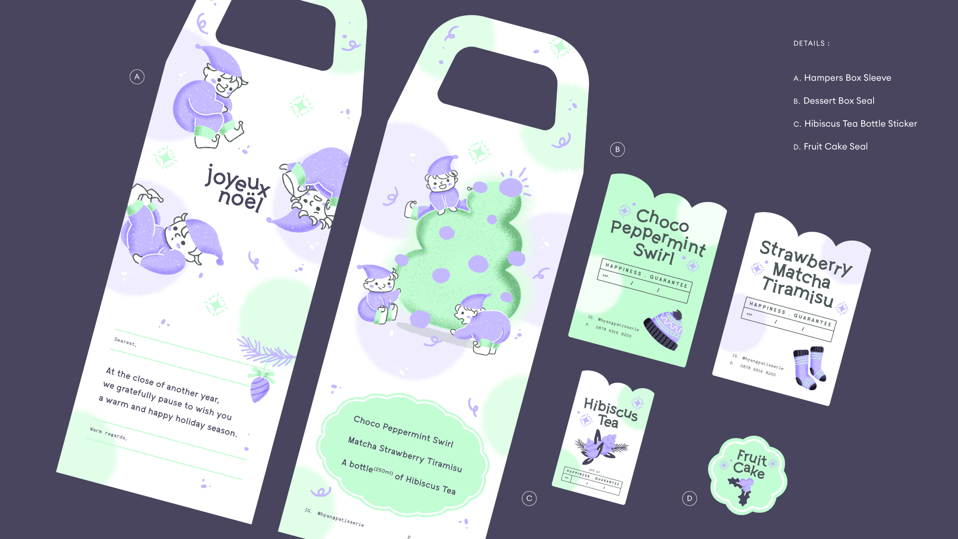
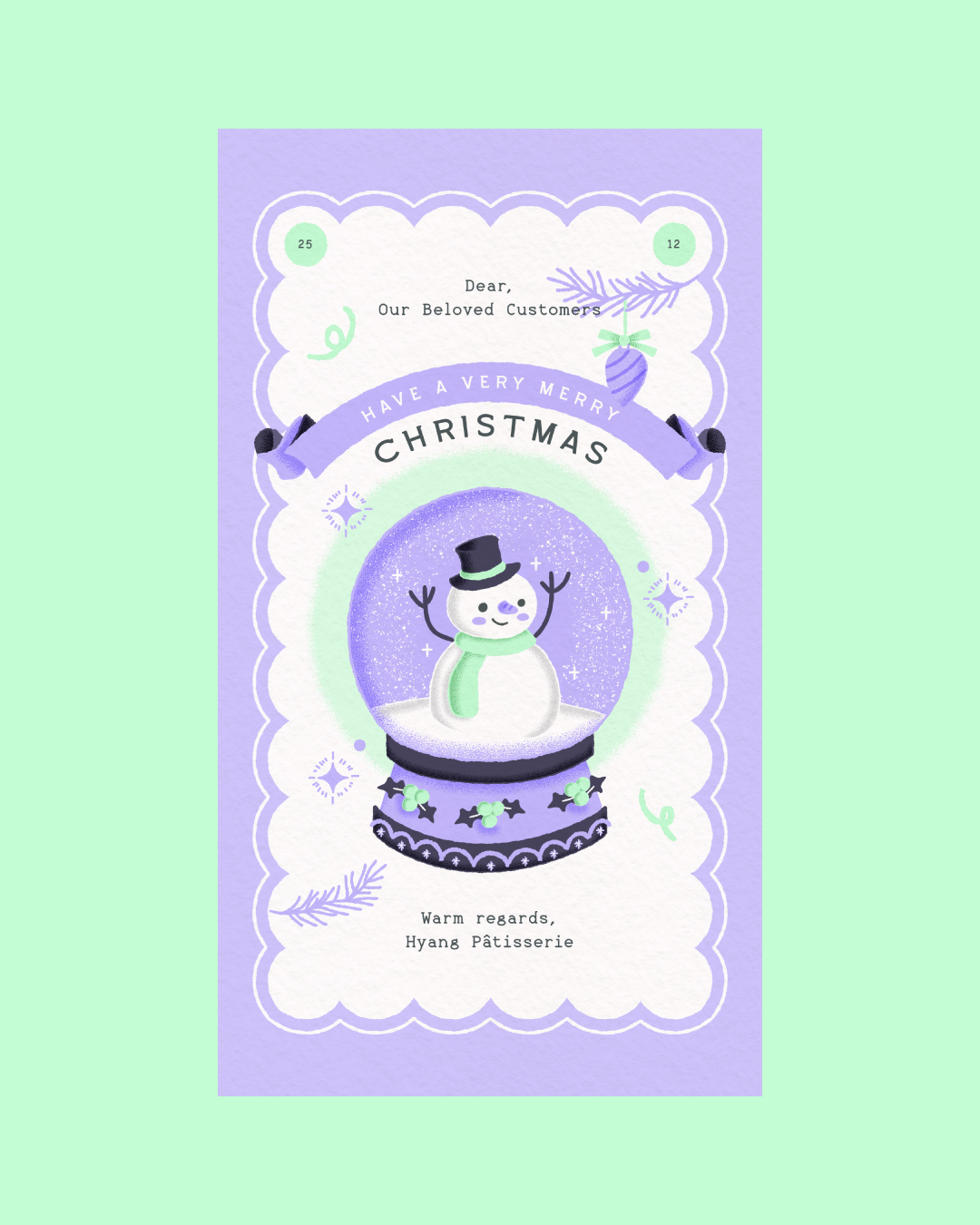
It's that time of the year again!
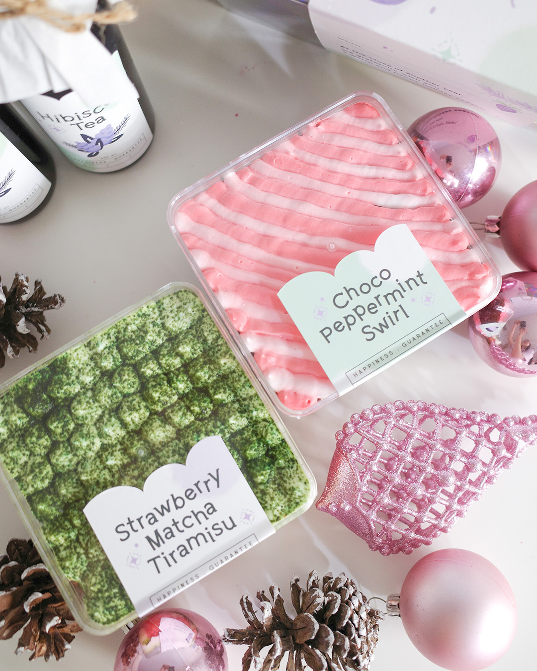
Hyang Pâtisserie launches 2 type of hampers to spread the merry spirit of Christmas and New Year.
Featuring their special edition hampers packed inside gorgeous-looking seasonal themed assorted cakes and drinks to be sent for your loved ones.
Featuring their special edition hampers packed inside gorgeous-looking seasonal themed assorted cakes and drinks to be sent for your loved ones.